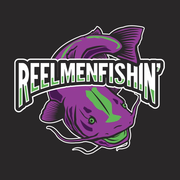
@REELMENFISHIN
This logo was for a content creator who live streams his night fishing adventures. He was gaining tens of thousands of followers and a couple sponsors and wanted a logo to reflect that. His content was mainly catfishing under black light at night. I created this very colorful purple and green logo to reflect the black lights and went with a very sporty looking treatment.
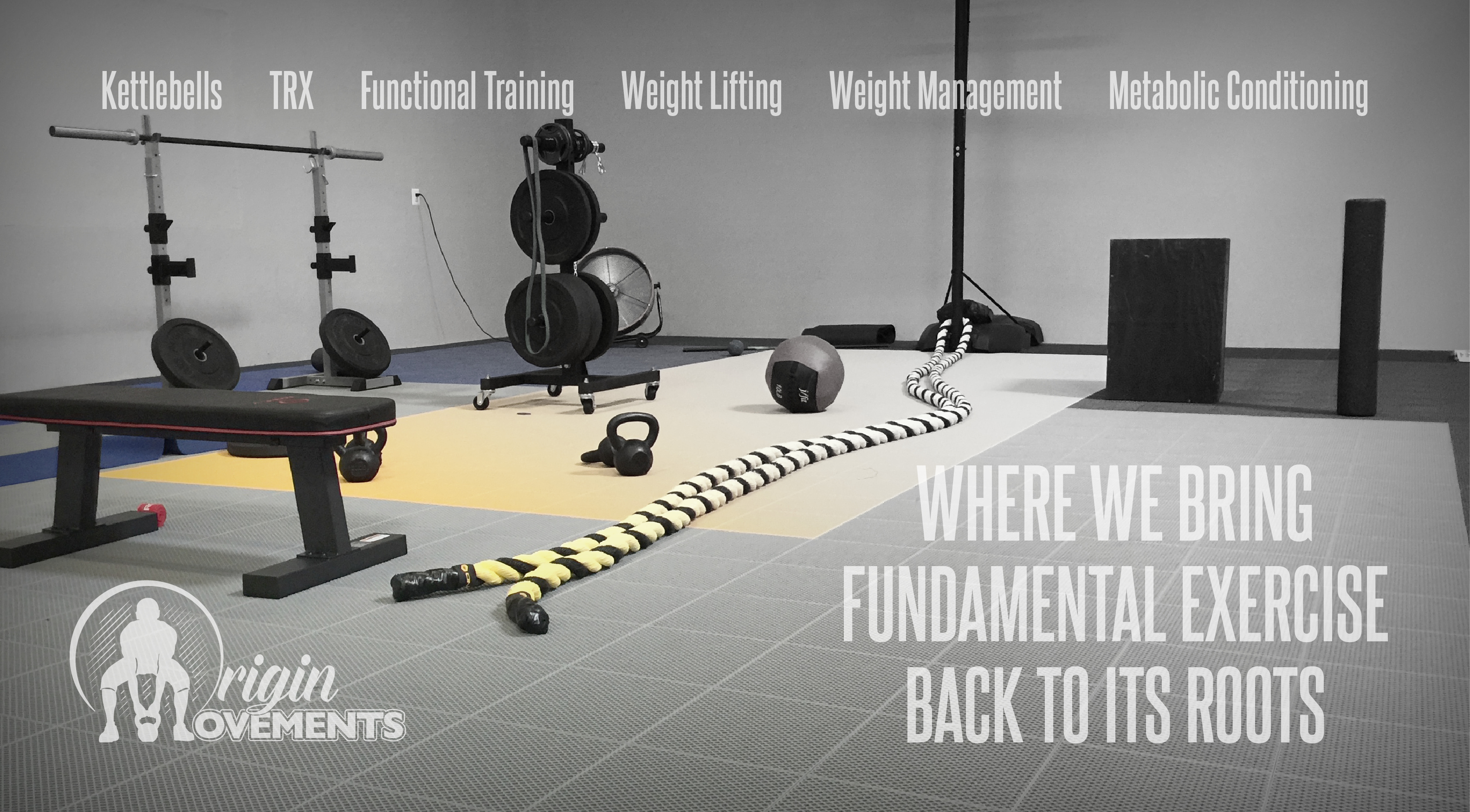
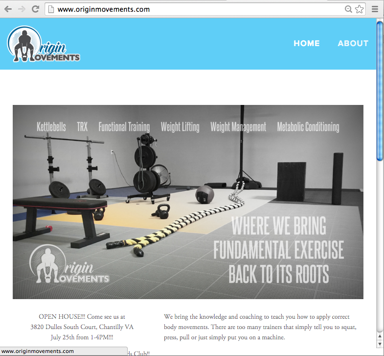
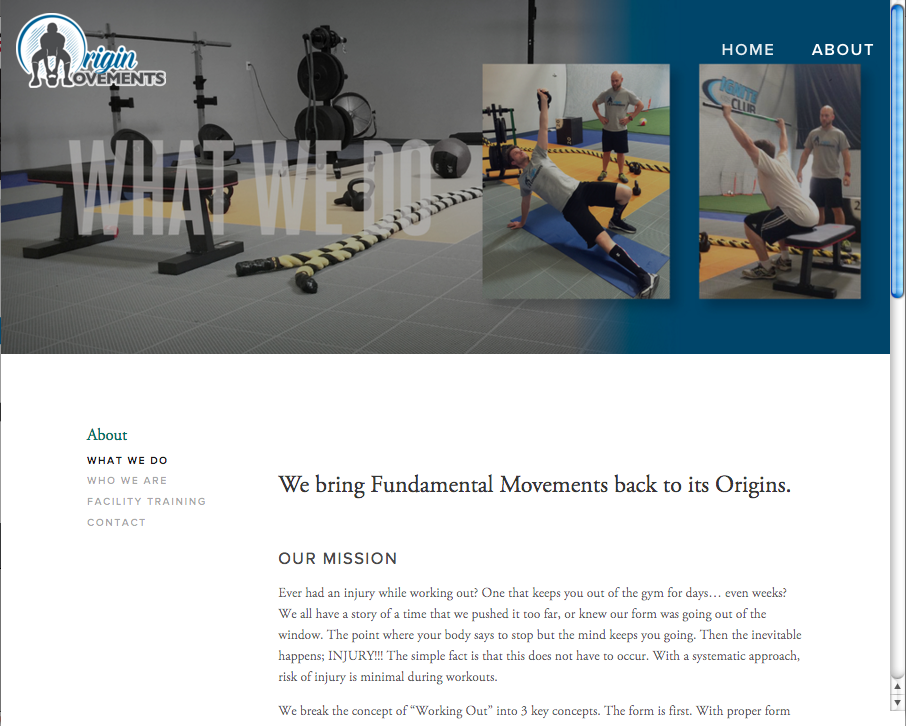
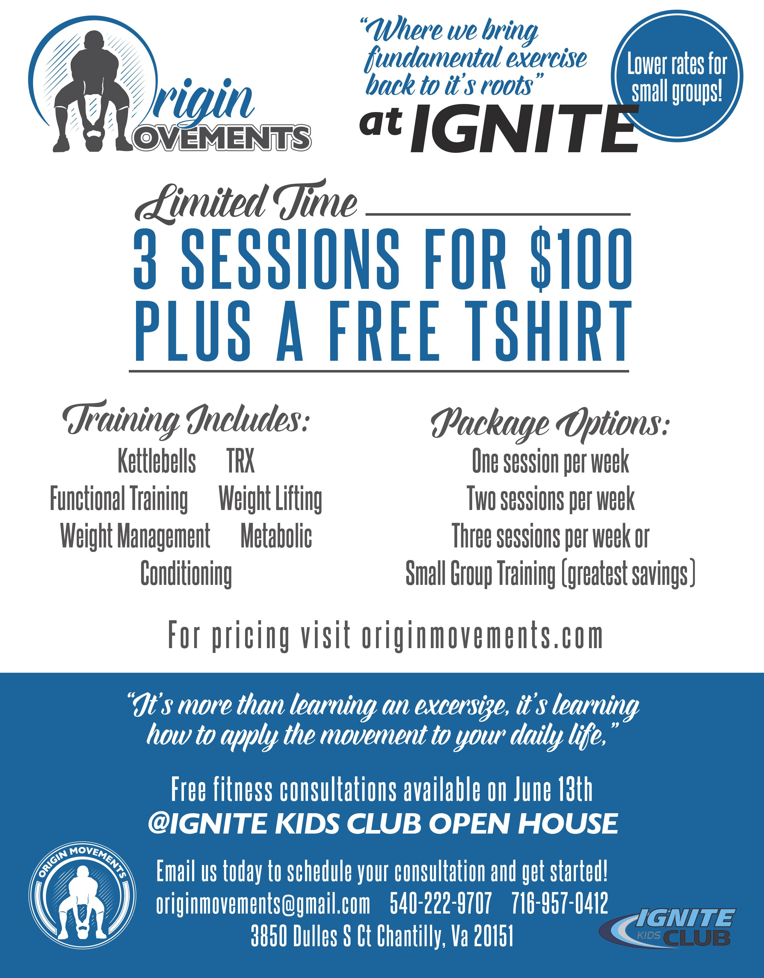
Origin Movements Person Training
I designed this logo with the thought in mind that most people wouldn’t necessarily get the idea of what the company did by the name. That being said, I created it with the idea that the logo would have to be obviously fitness related without question. While drawing O’s and M’s, I came up with the idea to use the person in kettle bell form as the “M”. The company focused on function exercise and the kettlebell is a common piece of equipment that lives in that realm. It was a perfect solution. After the logo, I helped design a few page banners on the client’s website after showing up to a clinic and taking a few photos.
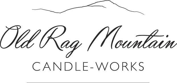
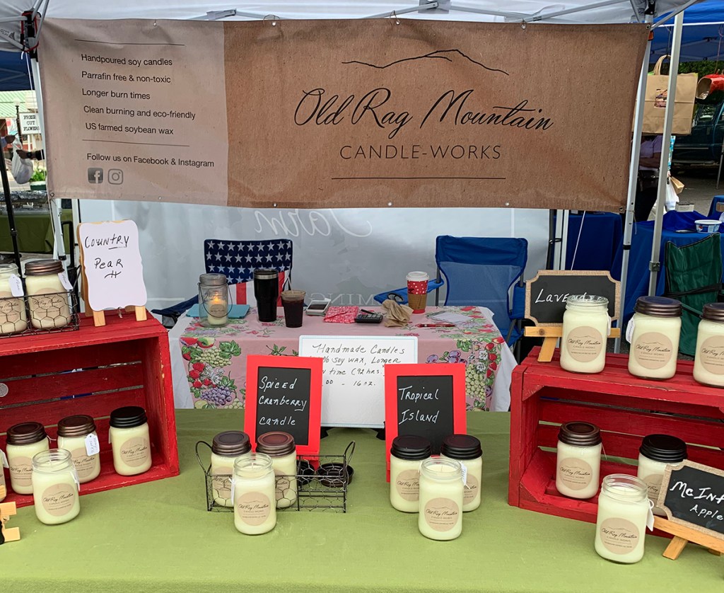
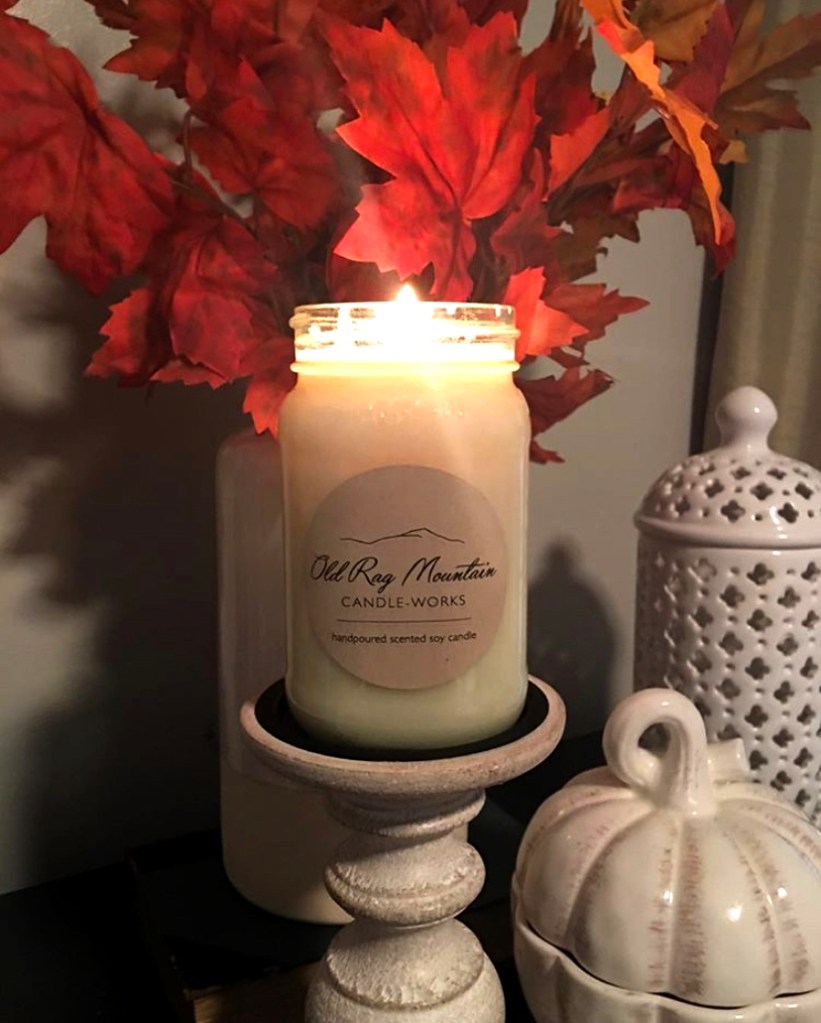
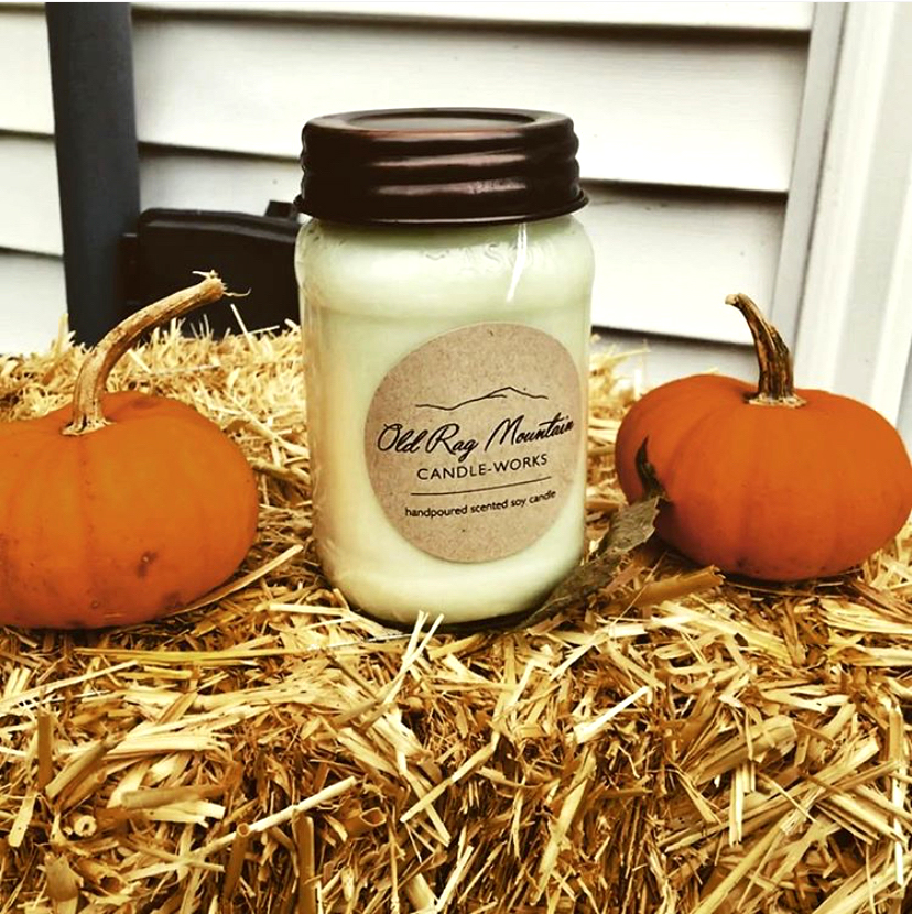
Old Rag Mountain Candle-Works
This logo was designed for a local company that makes hand-poured soy wax candles. The design was created very simple and clean, since the owner intended on printing her labels on craft paper for a rustic feel. The element of the mountain on top of the logo is that of Old Rag, which is a well known mountain in the Shenandoah. The packaging which was already in place drove the design and they compliment each other well.

Raising The Bar Performance
RTBP is a personal training company with an online and social presence. The fact that the company had such a long name but would have to fit into these square/ circular spaces drove the decision to make this a clean circular logo. Since the phrase “Raising The Bar” could have a few interpretations, I felt the need to have an element of the barbell embedded prominently into the logo.
Some other various logo’s that I’ve worked on over the years…